Renko charts
Renko charts are a type of trading chart that filter out small price movements so that traders can focus on the larger trend. They are created by Renko bricks. The price must move a specified amount to create a Renko brick. When the price is rising, the Renko bricks are white or green. When the price is falling, the bricks are black or red. This makes it easy to spot the current direction in which the price is moving.
When utilised correctly, Renko charts can help to eliminate confusion based on price direction and can be incorporated into a trend trading strategy. Learn how to use Renko charts, how to change their settings when setting up a new trade and how they differ from other types of price chart on our advanced trading platform, Next Generation.
How do Renko charts work?
A Renko chart is a type of price chart created by bricks that move up or down from the previous brick at a 45-degree angle. Bricks are never directly beside one another. The user of the Renko chart determines the brick size for the chart, which then determines when a new brick will form.
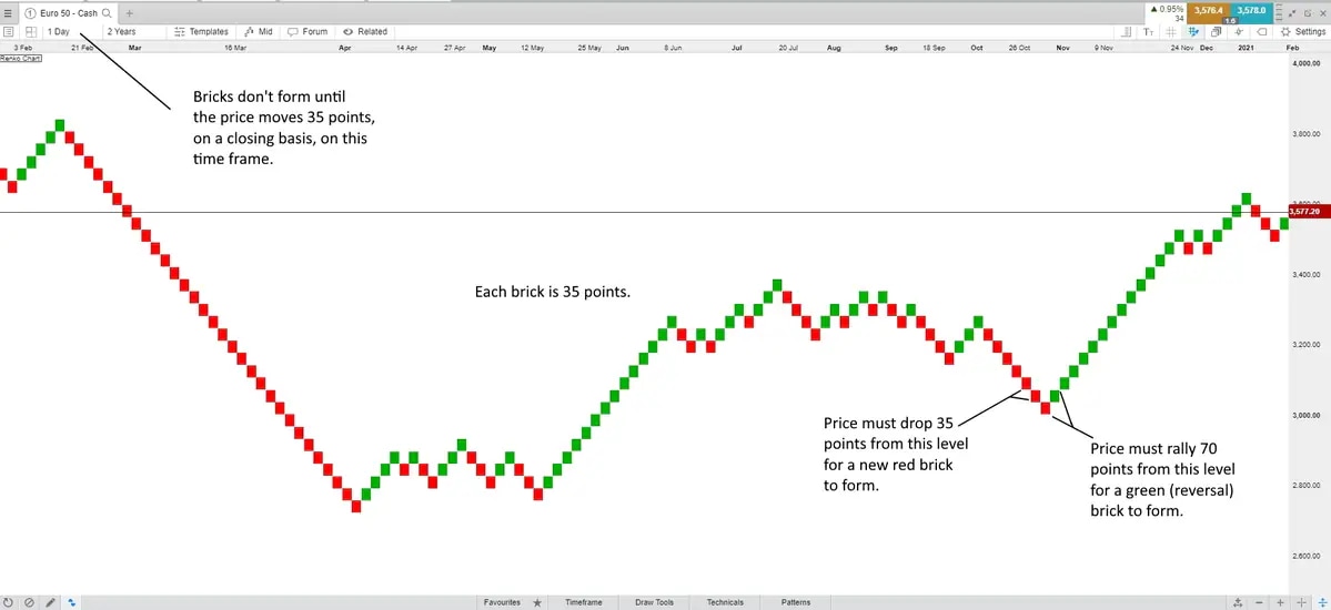
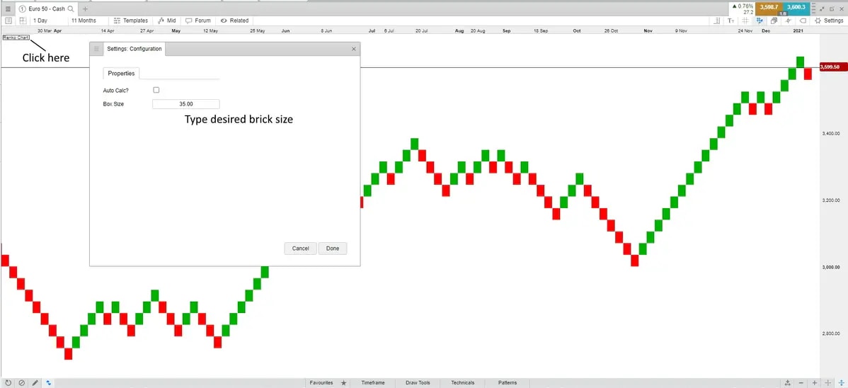
As an example, let’s analyse the below Euro 50 Index price chart. If a 35-brick size is chosen, this means that the price needs to move 35 points from the closing price of the prior brick in order to form a new brick in the current direction. Since bricks can’t form beside each other, the price needs to move 70 points to form a brick in the opposite direction. Only moves of 35 points, in this case, are highlighted by the bricks. Moves smaller than 35 points (from the previous brick) will not form new bricks.

Notice that the timeframe on the chart is set to one day. This means that new Renko bricks will only form based on the closing price of the day. Since the previous brick was red at the far left of the chart, the price needs to drop 35 points below the low of that red brick to form another red brick. Since this is a daily time frame, the price could drop 50 points below that level, but if the price closes less than 35 points below the last red brick, a new brick would not be drawn as it is only the closing prices that matter.
The time frame can be set to a number of different intervals between one second and one month. Choosing a one-minute chart means that bricks are drawn based on the closing price each minute. Learn more about trading on different chart timeframes. Renko charts can be used to display price data for any financial instrument, such as stocks, currencies, ETFs, commodities, indices and treasuries.
Understanding Renko charts in trading
Renko charts tend to filter out small price movements. This chart type is therefore good at highlighting trends and can even be used as a type of trailing stop-loss.
For example, the above chart shows an extended uptrend from the middle of May into early June. At no point did the Renko chart reverse. A trader holding this trade could have profited 385 points (11 x 35) before the first red brick occurred, which could typically provide an exit signal, as the downtrend had then begun.
Following this, there was an extended drop in October, which could signal to traders to short their positions and avoid buying. This was followed by a strong uptrend in November, providing steady returns for anyone holding a long trade through all of the green bricks.
There is also a drawback, though. There are times where the Renko chart appears very choppy between June and October. Attempting to buy and sell based on changes in colour or direction during this period could possibly result in frustration and losses. Therefore, Renko charts are best used in conjunction with price action analysis and other trading strategies as opposed to being used completely on their own.
Renko bars
Renko bricks are sometimes called boxes, bars or blocks. Bar is a term that comes from bar charts, where each data point is a bar, just like each data point on a candlestick chart is a candle.
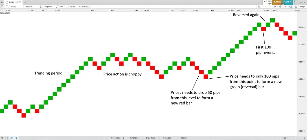
Below is another example of a Renko price chart, where each brick or bar represents 50 pips of movement in the EUR/USD currency pair. We have highlighted where there are prominent trends, choppy price action and trend reversals.
Renko vs Heikin Ashi
Heikin Ashi charts differ from Renko charts in that they collect an average of recent price movements, whereas Renko charts focus on the greater trend. This type of candlestick chart incorporates prior candle prices to come up with an average price that appears smoother than traditional candlesticks.
The screenshot from our platform below shows the difference between these chart types. On the left, the Renko brick size is $1.50 and shows five months of price action. The Heikin-Ashi chart on the right also shows five months of price action in crude oil.
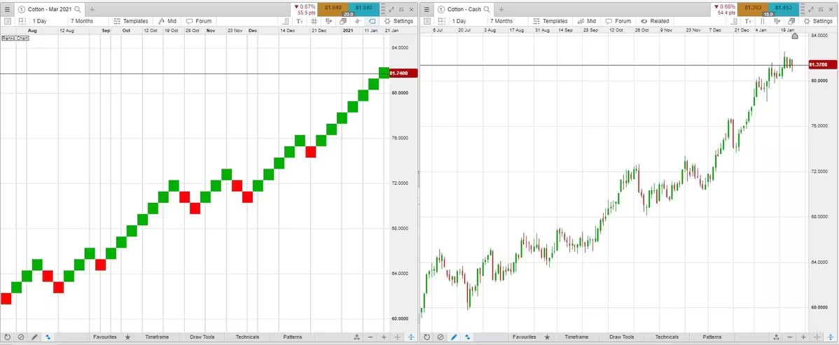
Renko charts vs candlestick charts
Candlestick charts focus more on timeframe and small price details than Renko charts. A new candlestick will form at every time interval, regardless of how far the price moves. For example, on a daily candlestick chart, assuming there was at least one transaction, a candle will form on that day, showing its high, low, close, and open prices. Renko charts don’t show the high, low, close, and open of each trading day, and they also don’t form a new brick at every time interval. A new brick is only formed when a minimum movement threshold is reached or exceeded. Learn more about candlestick trading.
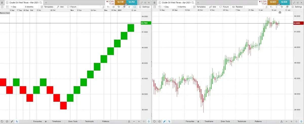
The price chart below shows two cotton contracts. The one on the left uses a Renko brick size of 1.00, and the chart on the right uses daily candlesticks.
Renko strategy
Traders can incorporate Renko charts into their own trading strategy. Here are some ways to do so:
Renko chart patterns - Just like patterns form on candlestick charts, such as head and shoulders, triangles, and rounded tops or bottoms, similar patterns appear on Renko charts. Such patterns may be easier to spot on a Renko chart since there are less small price movements when compared to a candlestick chart. These types of chart patterns can be detected using our chart pattern scanner.
Utilising the Renko chart as a trailing stop-loss - For traders seeking to capitalise on trends, Renko charts can help with sticking to the trend until there is sizable reversal. When and if trends run for a long time, this could result in large profits. Unfortunately, it’s hard to know which price moves will run and which will end in reversals, so trend trading strategies still come with risk.
Support and resistance - Renko charts highlight support and resistance levelsthat may not be visible on a candlestick or bar chart. When Renko charts continually turn lower or higher near a certain price area, this indicates strong resistance or support. Traders can use these areas for potential trades, taking short trades near resistance or buying near support. Traders could also watch for breakouts in these areas on the Renko chart to identify the start of a new trend.
Renko chart scalping
The aim of a scalping strategy is to profit from small price movements, often multiple times each day. Renko charts can be used to provide overall trend direction, but since the bricks don’t continually update, like candlesticks do, bricks may not always provide timely data. Therefore, Renko chart scalping may not be the best format for this type of strategy.
That said, scalpers could set the Renko bricks to form based on smaller time intervals, such as 30 minutes or even less. This way, the Renko chart will highlight small trends and reversals that may be suitable for scalping.
Renko swing trading
Renko charts may be helpful for swing traders who are attempting to capture trends and don’t want to exit their position until there is a sizable reversal. For example, when the price is trending upwards, the Renko chart will continue to form green bricks until there is a reversal of a certain size. The swing trader can pre-determine what this reversal size is. When it occurs, they can then decide to exit their long position if they wish.
Breakouts above support or resistance levels on either a Renko or candlestick chart could act as potential trade triggers. Similarly, if the price is stalling at resistance, the swing trader could initiate a short position and attempt to hold it until the price drops to support level, or until the Renko chart flips colour or direction. A similar strategy could be implemented with going long near support level.
Renko trading system
To utilise Renko charts on our Next Generation trading platform, select a trading instrument from more than 10,000 that we have available in the product library. You can spread bet or trade CFDs on forex, commodities, shares, indices, ETFs and treasuries. Register for an account to get started.
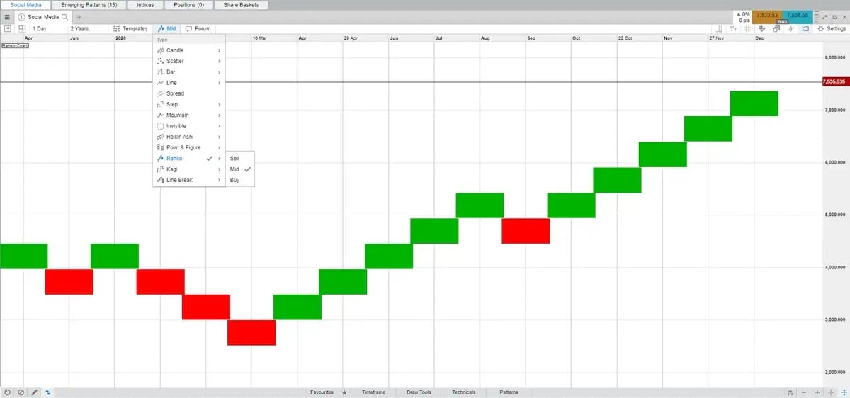
You can filter by chart type by clicking on the chart type button and selecting Renko. As you can see in the screenshot below, the chart can be further set to Buy, Mid or Sell. This refers to the price that the product can be bought or sold at, so if you are looking to buy, you could select the Buy view, and if you are looking to sell, you could select the Sell view. Mid is the mid-point between the buy and sell prices.
Our Renko trading system could be applied to various trading instruments to determine if they are useful for your strategy and whether this chart type could aid your trading decisions. If it is not suitable for your needs, then there is a multitude of other chart types that you could try instead, such as a candlestick chart, line graph and mountain chart.
Renko settings
You are able to modify the Renko settings on our platform by choosing the brick size and timeframe that you prefer. When setting up an initial Renko trade from our chart type menu, the bricks are auto-calculated. To select your own settings, click on the Renko Chart button in the upper left-hand corner, which will bring up the Renko settings. Type in the brick size and select the desired chart timeframe. In this case, bricks will be based on closing prices from this timeframe.
Renko system MT4
While our MetaTrader 4 (MT4) platform does not offer Renko charts as an automatic built-in feature, it does have a library where users can download third-party software and indicators. Searching for a Renko chart indicator in the “Code Base” tab of MT4 reveals several options. For example, you can select to make the Renko chart appear like an indicator below the main charting area.
As always, traders should exercise caution when using third-party software on MT4, since the market and coding knowledge of the writer is unknown. Each downloadable Renko chart indicator will have its own instructions and settings. To learn more, open an MT4 account.
Pros and cons of Renko charts
Renko chart advantages
Small price moves are filtered out to create a cleaner-looking chart.
You can customise what constitutes a price reversal in the chart settings.
Support and resistance levels can be identified.
You can utilise the Renko chart as a trailing stop-loss for trend trades.
The current price direction based on the most recent brick colour can be seen.
A Renko brick-size calculator can help to determine the optimal brick size over a chosen time frame.
Renko chart disadvantages
Renko charts can appear choppy and don’t provide a clear price direction when there isn’t one. When an asset is choppy, the Renko chart will be too.
A cleaner-looking chart means less information. Closing prices, highs, lows, and opening prices are all lost when using a Renko chart.
A Renko brick-size calculator may provide an optimal brick size for past data, but that brick size may not be ideal for future price movements.
Trading is not easy, so there is no easy Renko system that will work for every trader or every market.
For any trading strategy or chart type, losing trades is a natural part of trading. However, traders can always decide to control their risk and manage how much capital they are prepared to part with on losing trades. In particular, adding stop-loss orders to Renko charts can help traders to exit a trade at a predetermined level when the asset doesn’t move in the expected direction. Another thing to consider is only putting a portion of available capital into a single trade. This can help to reduce the chance of large losses if that single trade doesn’t work out.
Disclaimer: CMC Markets is an execution-only service provider. The material (whether or not it states any opinions) is for general information purposes only, and does not take into account your personal circumstances or objectives. Nothing in this material is (or should be considered to be) financial, investment or other advice on which reliance should be placed. No opinion given in the material constitutes a recommendation by CMC Markets or the author that any particular investment, security, transaction or investment strategy is suitable for any specific person. The material has not been prepared in accordance with legal requirements designed to promote the independence of investment research. Although we are not specifically prevented from dealing before providing this material, we do not seek to take advantage of the material prior to its dissemination.