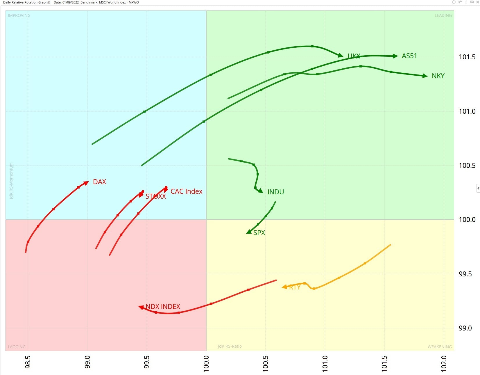
Three indices have progressed from the improving quadrant to the leading quadrant over the past week, as shown in the Relative Rotation Graph (RRG) below. The UK’s FTSE 100 (UKX), Japan’s Nikkei (NKY) and Australia’s ASX (AS51) are all travelling in a positive direction and continuing to outperform our benchmark, the MSCI World Index.
In the US, the Dow (INDU), S&P 500 (SPX) and the small-cap Russell 2000 (RTY) still have a JdK Relative Strength Ratio reading of more than 100, but the tech-heavy Nasdaq (NDX) has slipped in to the lagging quadrant due to weakness in technology stocks.
This contrast between leading and lagging indices may create possible pair-trading opportunities.

Chart 1 - Daily RRG of major indices versus MSCI World
S&P 500 loses momentum
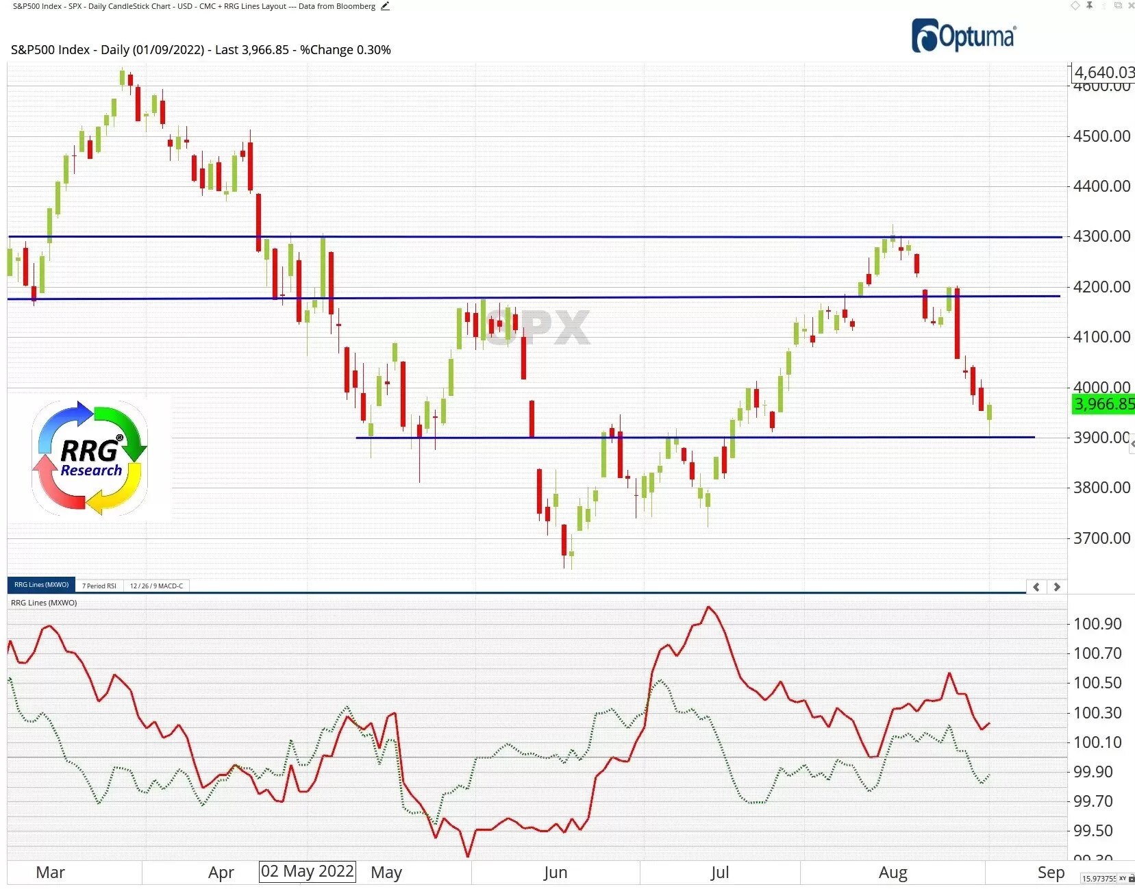
The S&P 500 (SPX) met resistance at 4,300 in August as an eight-week rally came to a halt, as the chart below shows. The index has since slipped and is approaching support at 3,900. As shown in Chart 1, above, SPX is moving from the leading quadrant, through the weakening quadrant, and is heading in the direction of lagging.
The RRG Lines in the lower part of the below chart also highlight SPX’s loss of momentum. The red JdK-Ratio line and the green JdK-Momentum line are both trending lower, signalling that the index may remain under pressure in the near term.

Chart 2- Daily SPX with RRG versus MSCI World Index
S&P 500 share basket dips
Our SPX RRG Momentum+ share basket, which is 100% invested in US energy stocks, is highly sensitive to price movements in the energy sector. As we identified last week, this aggressive weighting in energy led to outperformance relative to the broader S&P 500 over recent months. However, the basket has dropped this week amid weakness in the US energy sector.
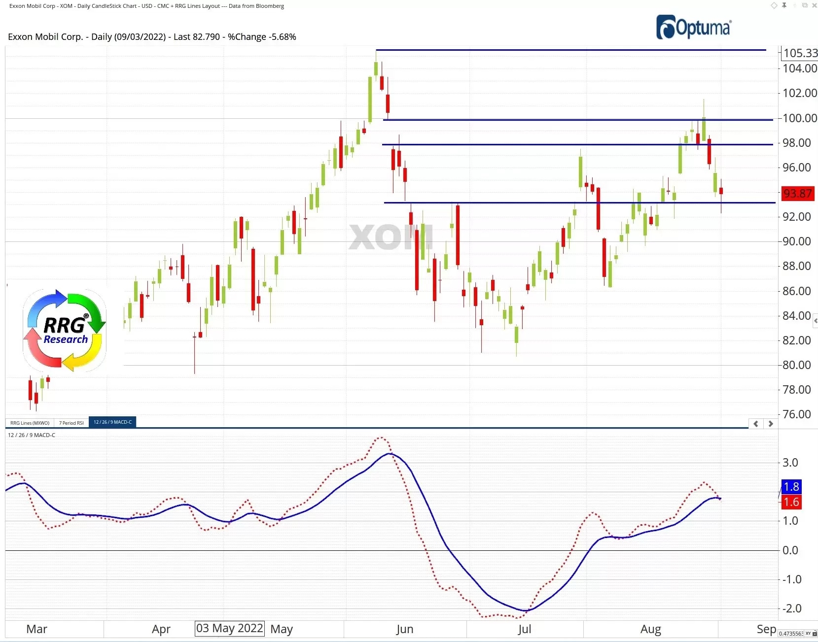
The chief culprit has been Exxon Mobil [XOM], the sector’s biggest stock by market cap. As the chart below indicates, XOM cleared overhead resistance at 98, but stalled at the top of the gap that was created from 10-13 June. The stock then plunged this week to the support level at 93. The daily moving average convergence divergence (MACD), the red dotted line in the lower portion of the chart, is crossing below the blue signal line – a bearish indicator. A move towards the June high of 105, which many traders were hoping to see, appears to be on hold for the time being.

Chart 3 - Daily Exxon Mobil
Pricing is indicative. Past performance is not a reliable indicator of future results. RRG’s views and findings are their own and should not be relied upon as the basis of a trading or investment decision.


