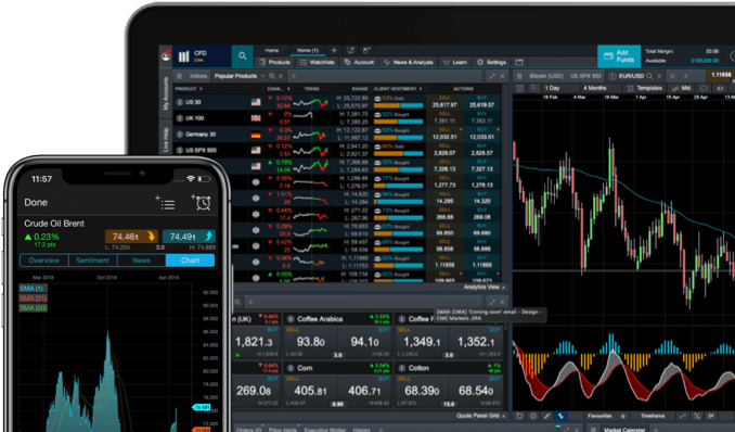
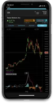
The actual buy and sell signals are given when the two lines cross. A crossing by the white MACD line above the slower signal line is a buy signal (when the red ribbon crosses and becomes white). A crossing by the faster white MACD line below the slower line is a sell signal (when the white ribbon crosses and becomes red). The MACD values also move above and below a zero line, which gives another set of signals about price trends. Technical analysts believe that an overbought condition is present when the lines are too far above the zero line. This can mean that there has been too much buying, and the price trend could reverse soon. And so an oversold condition is present when the lines are too far below the zero line.
Analysts who use the MACD believe that the best buy signals are given when prices are well below the zero line (oversold), and the white MACD line crosses from below to above the red signal line.
The blue and orange coloured section of the MACD shows the strength of the trend. A growing blue chart shows an increasingly positive trend while a shrinking blue chart shows a decreasingly positive trend. And vice versa – a growing orange chart shows an increasingly negative trend while a shrinking orange chart shows a decreasingly negative trend. When the histogram hits the zero line, it then switches colour indicating there has just been a MACD crossover.

