*Trade one-hundredth the size of a standard lot
Why trade with CMC Markets?
Instruments
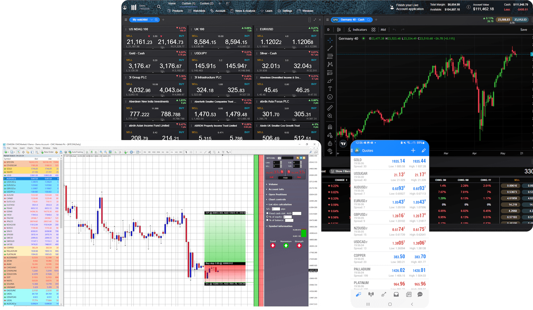
Our platforms at a glance
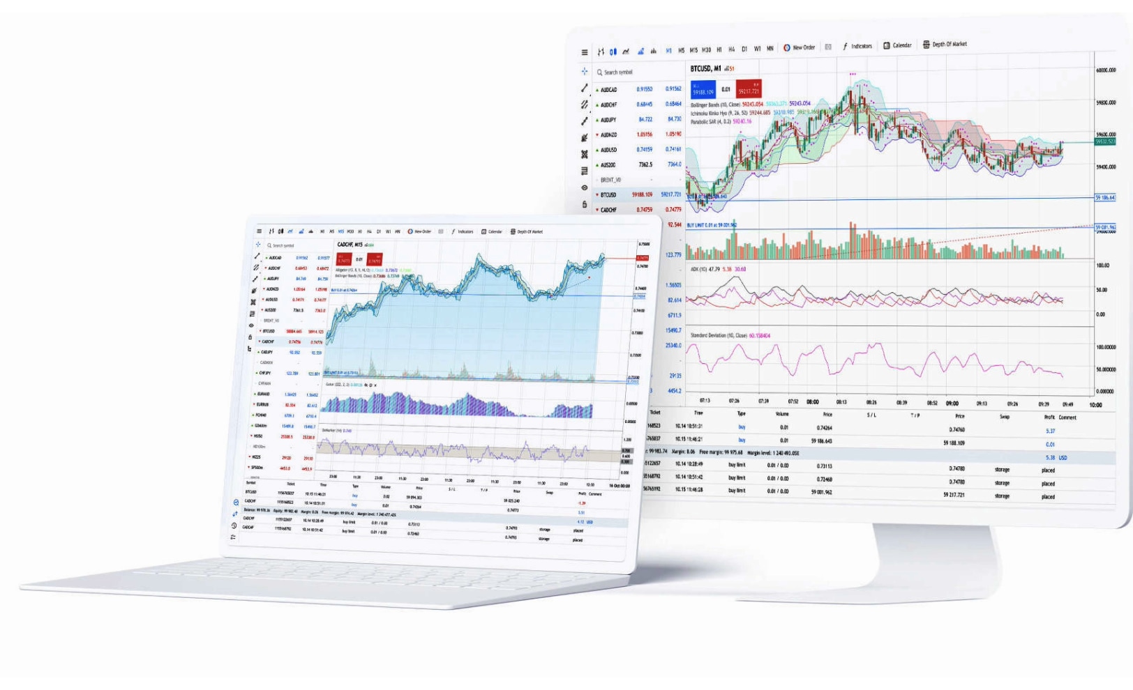
MetaTrader 4
Trade on the world's most popular trading platform, with tight spreads and ultra-fast execution.
Trade on forex, indices, commodities and cryptocurrencies
- Spreads start from 0.0 pips with our FX Active account³
Fast, one-click trading
- Lightning-fast execution ⁴
Customisable charts with pre-installed indicators
Automated trading with Expert Advisors
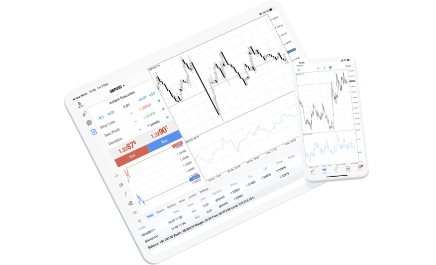
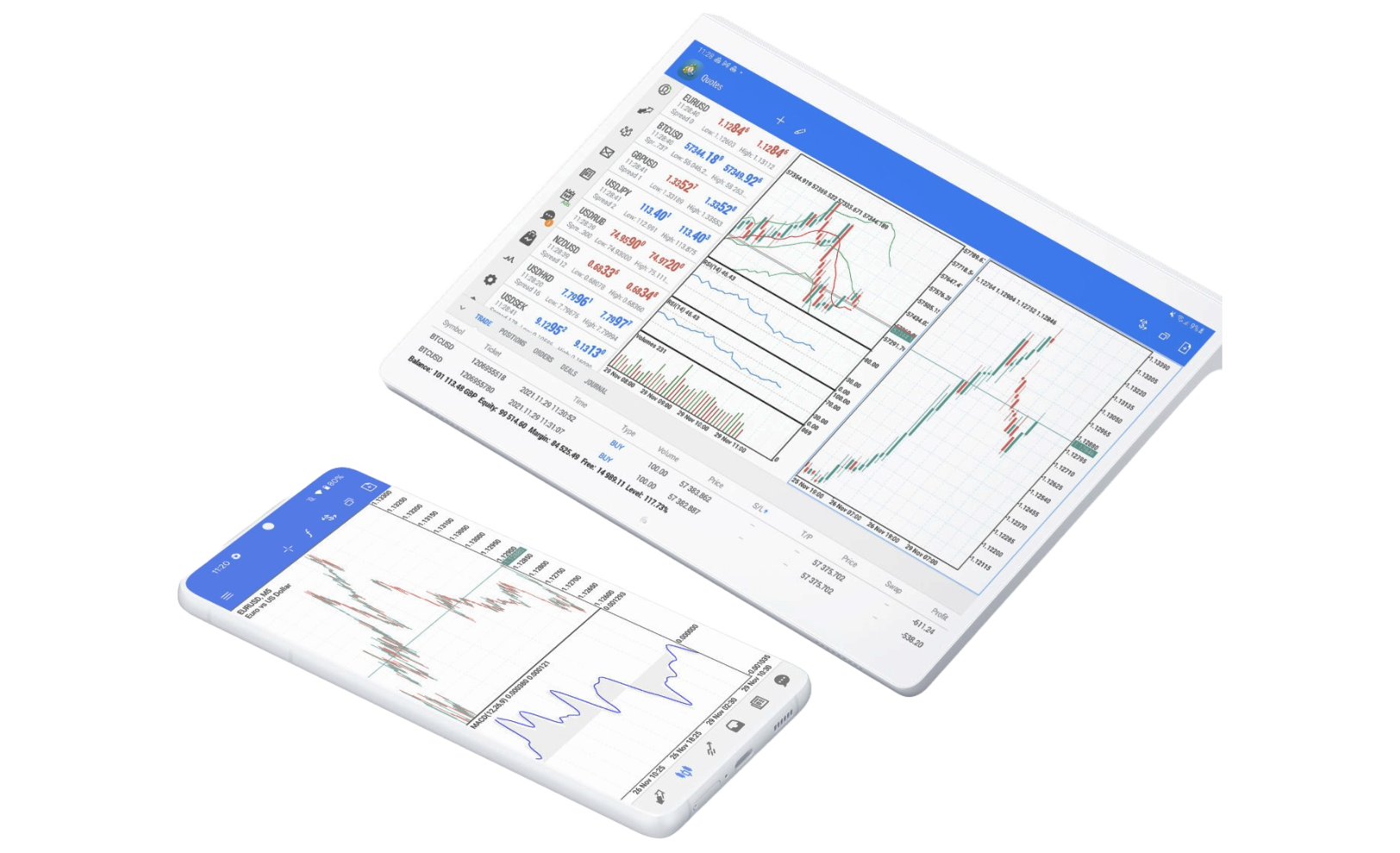
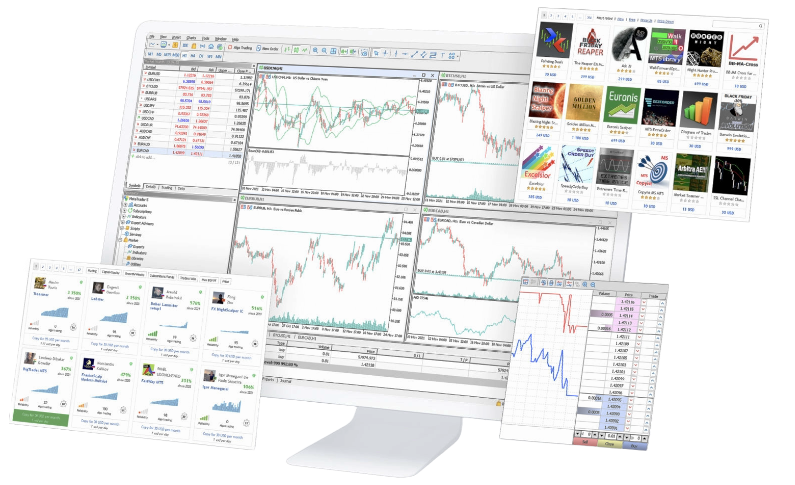
MetaTrader 5
A powerful trading platform designed to provide access to global markets, with advanced trading features and real-time data.
Trade on forex, indices, commodities, shares and cryptos
- Spreads from 0.0 pips with our FX Active account³
One-click trading
- Ultra-fast execution⁴
More order types, timeframes, and pre-installed indicators than on MT4
Depth of market display and inbuilt economic calendar
Experts Advisors with faster strategy tester
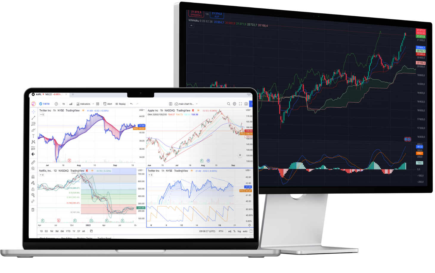
TradingView
Enjoy the best of both worlds: view and analyse charts on TradingView; trade with our tight spreads and fast execution.
Enhance your trading experience with TradingView’s renowned charts and indicators.
Get inspiration and ideas from one of the world’s largest online trading communities.
Prepare for key announcements with TradingView's easy-to-use financial calendar.
Set up personalised alerts using 13 built-in conditions based on price and volume.
Open, manage and close your trades with us in TradingView.

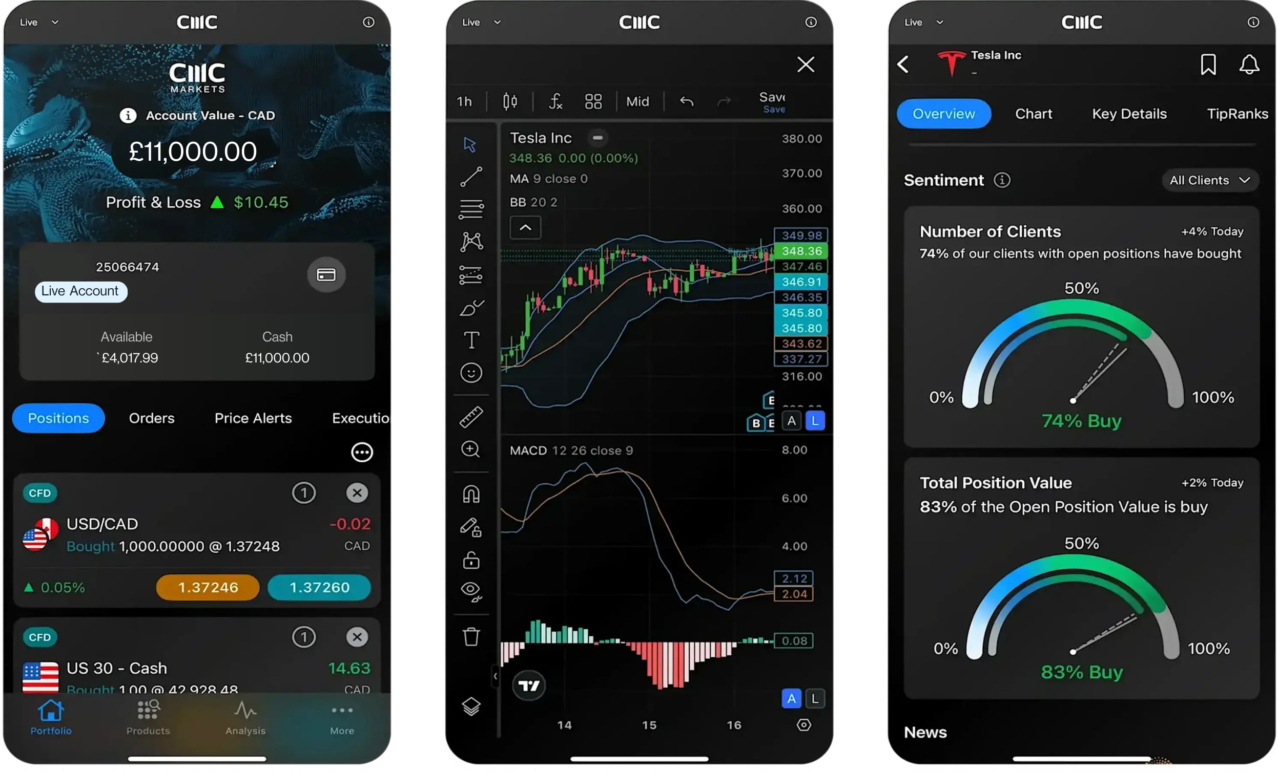
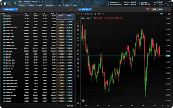
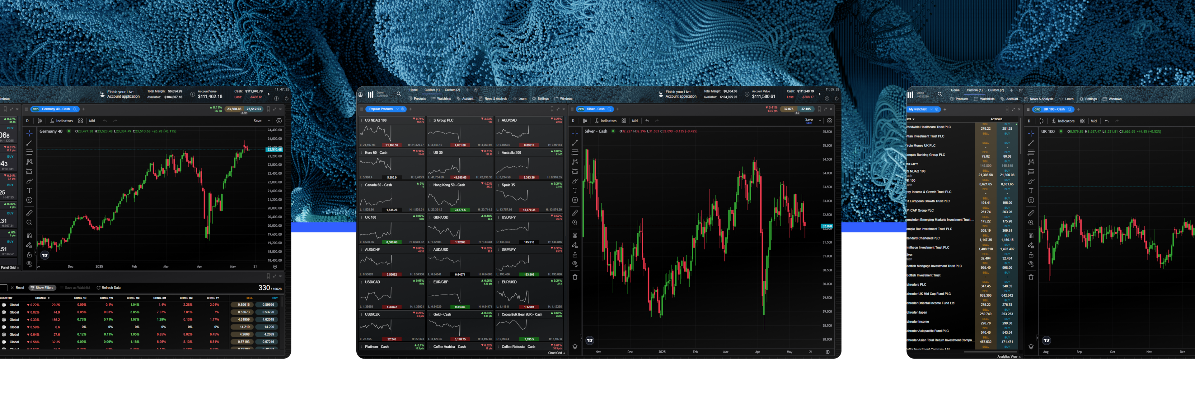
CMC Web platform
Integrated TradingView charts
Advanced order execution
Optimised mobile platform
TipRanks analysis
Client sentiment tracker
Pattern recognition scanner
Morningstar equity research and Reuters news
Fund your account with USDT and USDC, via Binance Pay.
Superior execution and reliability
Our pioneering technology and highly-regarded customer service, alongside a choice of powerful platforms, offers an ideal combination for serious traders.
Join over 2 million global traders and investors


Ready to get started?
If you already have an account, log in to your chosen platform.
Don't have one yet? Open an account now.