How to use charts on TradingView
Charts are a key part of the TradingView experience. Covering thousands of global financial instruments and featuring a range of technical analysis tools, TradingView's customisable charts allow you to visualise, track and analyse market movements, helping you to make informed trading decisions.
How do I view a chart?
To navigate to a chart from the TradingView homepage on a desktop device, hover your cursor over Products in the menu at the top of the screen and select Supercharts. On a mobile device, tap the three lines at the top of the TradingView homepage, select Products and choose Supercharts. TradingView’s charts can be viewed on both desktop and mobile devices. We’ll provide instructions on both so that you can follow on any device.
To customise the chart view based on your preferences, here’s what you need to do:
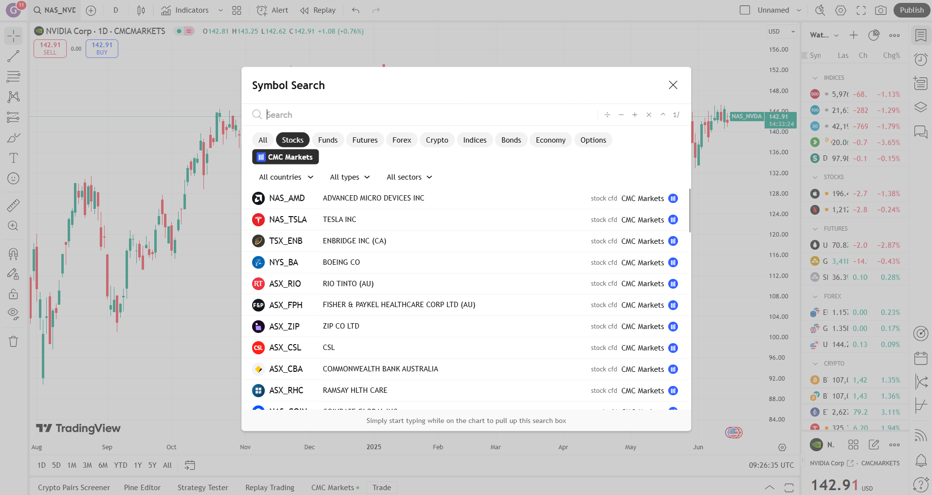
1. Pick an instrument
To bring up the instrument chart you want to view, select the search icon in the top-left corner. On mobile, tap the instrument ticker in the bottom left corner. In the pop-up window, search for an instrument by name (for example, Tesla) or ticker (e.g., TSLA). Or, if you want to browse instruments, you can choose an asset class (e.g., Stocks) and scroll through the instruments list.
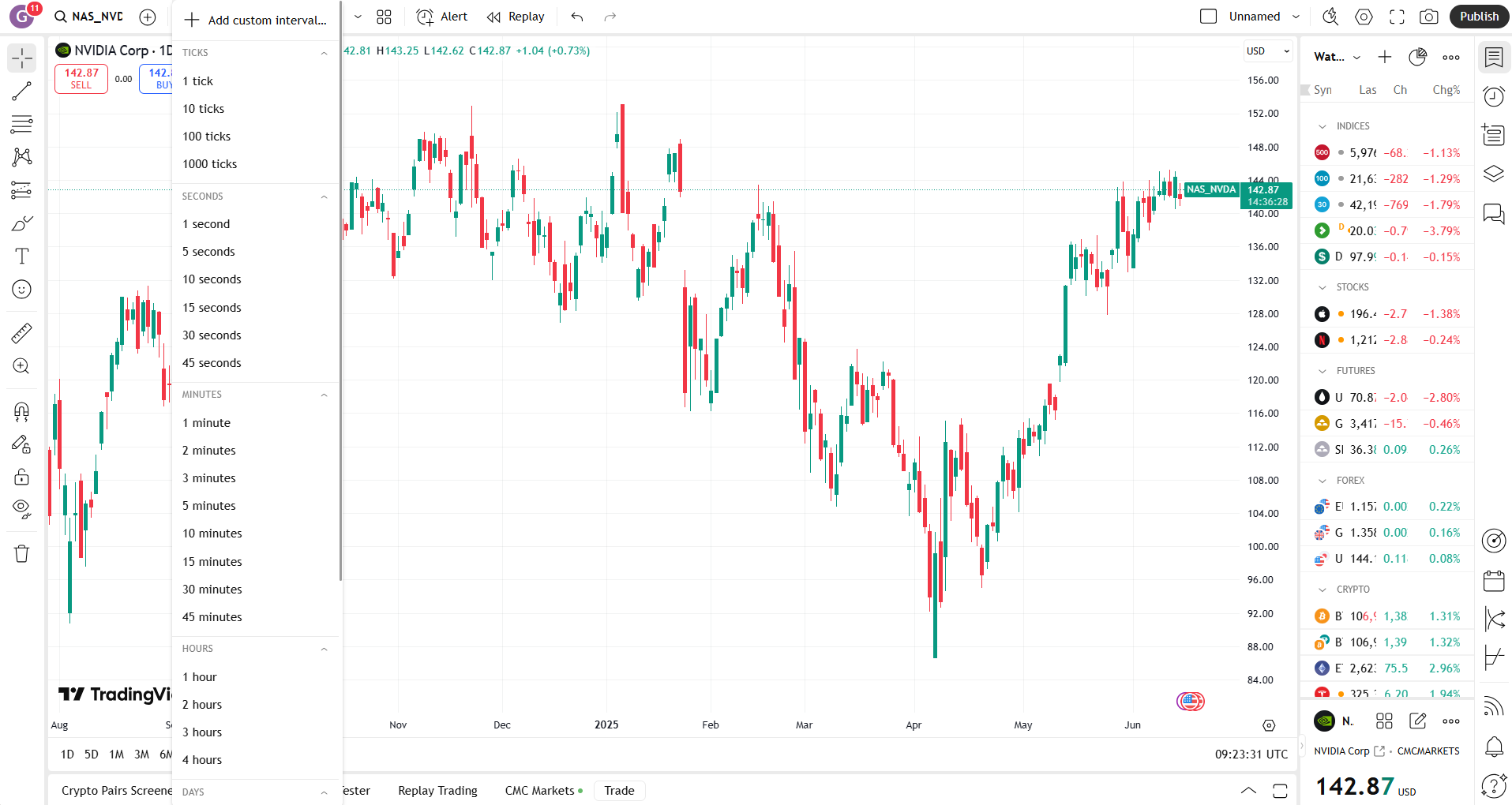
2. Choose a timeframe
Whether you're a scalper, day trader, or swing trader, use a chart timeframe that aligns with your strategy. This will help you to identify patterns and signals, increasing the accuracy of your analysis and enabling you to make faster, more confident trading decisions.
To change your timeframe, select the letter and/or number in the top toolbar. On mobile, tap the letter and/or number (by default it’s 1D) in the toolbar at the bottom of the chart. You can choose from a variety of options, including seconds, minutes, hours, days, weeks or months, or you can create a custom timeframe.
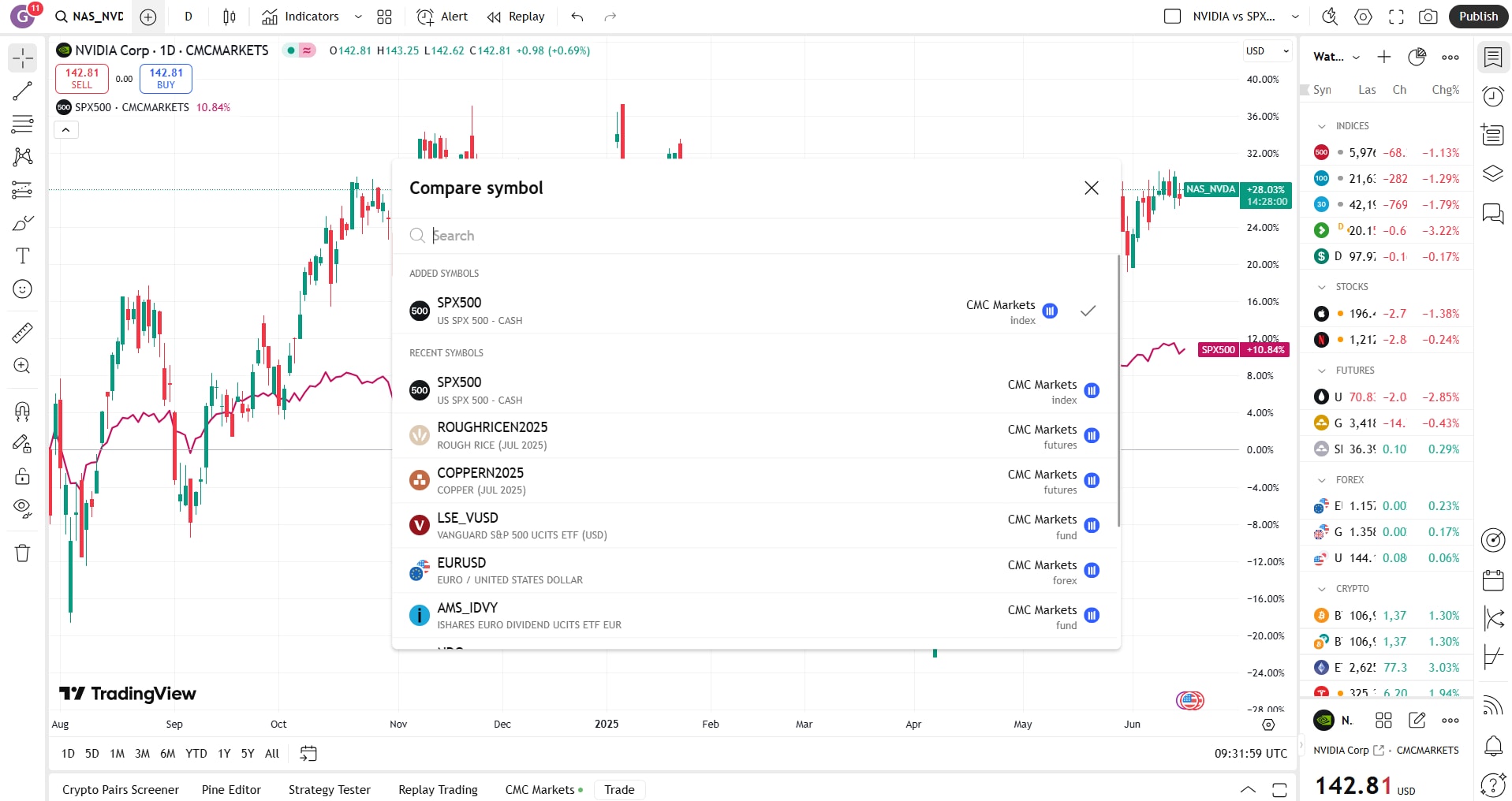
3. Compare instruments
Comparing one financial instrument to another, such as a stock to a benchmark index, may help put performance in context, potentially helping you to distinguish between broad market trends and instrument-specific behaviour. Meanwhile, a comparison of multiple instruments may help reveal outperformers or underperformers, helping you to make informed trading decisions.
To create a comparison, click the Add icon (as shown below) in the top toolbar and search for the instruments you would like to compare. On mobile, tap the slider icon at the bottom of the chart, which represents the ‘Analysis hub’. Then tap ‘Compare’, and search for the instrument you would like to add. There’s no limit to the number of instruments you can compare.
What charting features can I use?
TradingView offers several features that allow you to optimise and personalise your charts. Choose your preferred chart type, add technical indicators and overlays, set up alerts, and more.
Chart types
Here we look at some of the most common chart types on TradingView, but this list is far from exhaustive. You’ll find even more chart types under the chart icon in the top toolbar.
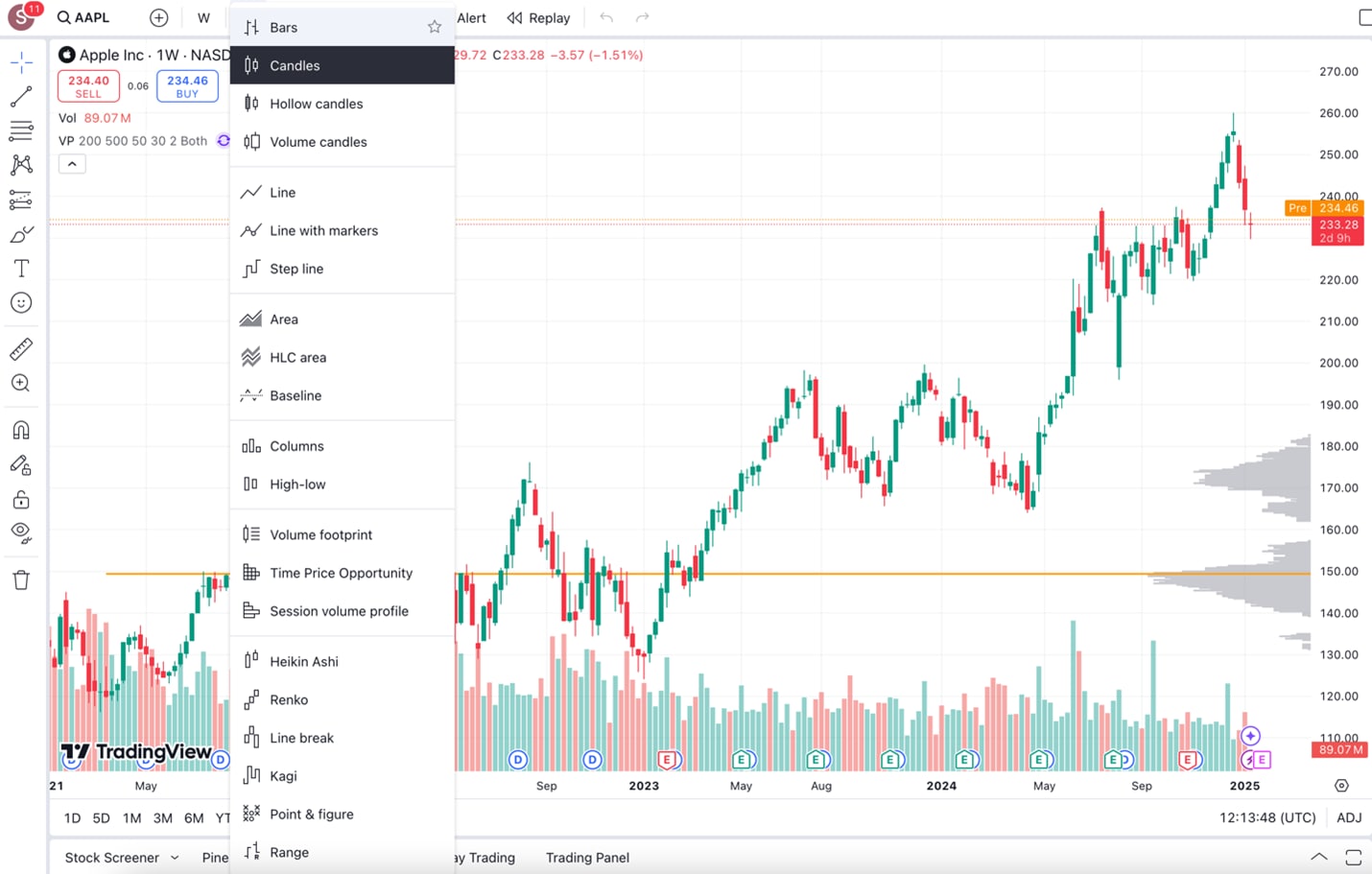
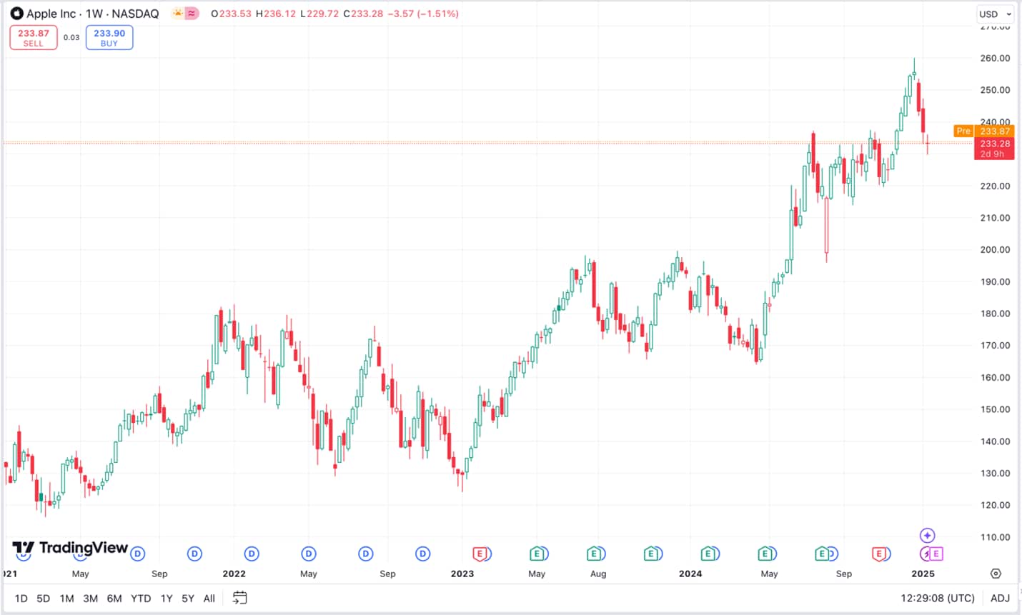
Candle charts
Candle charts illustrate price changes over time. Each candlestick shows the opening, closing, high and low prices for a given time period. A green bar indicates that the financial instrument increased in price during the chosen period, while a red bar indicates that the price decreased.
On a green candlestick, the base of the candle shows the opening price, while the top shows the closing price. The reverse is true on a red candlestick, where the top of the candle’s body indicates the opening price, and the base shows the closing price.
The ‘wicks’ indicate the range of price movement during the given time period. On both a green and red candle, the top of the upper wick indicates the high, while the bottom of the lower wick shows the low.
Widely used by traders, candle charts are the default chart on many trading platforms. Part of the reason for their popularity is that they’re adaptable and visually succinct:
Displaying the opening, high, low and closing prices, candle charts pack a lot of information into a clear and concise package.
Candle charts can be used to analyse patterns and trends, identify support and resistance levels, and gauge market sentiment.
The versatility of candle charts allows them to be applied to different markets and timeframes, making them suitable for all sorts of trading strategies.
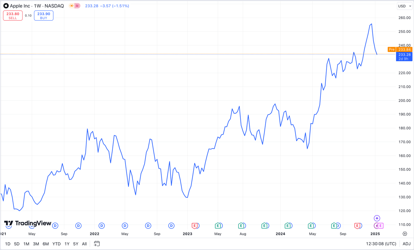
Line charts
Line charts are one of the most accessible and widely used chart types in financial analysis. They plot only the closing price of an asset over time, connecting each data point with a continuous line. The simplicity strips away market noise, helping traders focus on the overall direction or trend of a financial instrument.
Line charts are a fast and intuitive way to visualise market movements without distractions, making them a valuable tool for both new and experienced traders. While line charts are not as data-rich as candle charts, it might be useful for:
Long-term trend analysis
Beginners learning price action basics
Quickly comparing multiple assets on the same chart
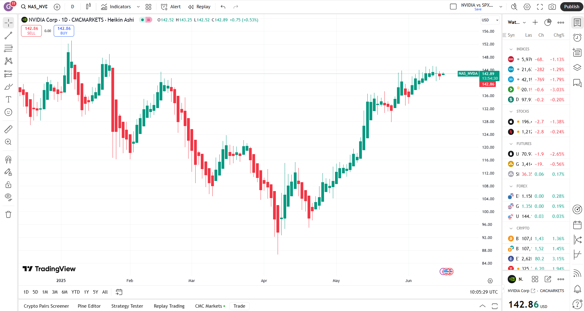
Heikin Ashi charts
Heikin Ashi, a Japanese term which translates as “average bar”, is the name given to a type of candle chart that uses average opening, closing, high and low prices to create a smoother visual representation of price action than you find on a standard candle chart. The smoothing effect filters out market noise and highlights trends more clearly.
While Heikin Ashi charts offer trend clarity, traders should be aware that they do not reflect exact market prices, so they’re best used in conjunction with other charts when you need precise pricing.
In summary:
Heikin Ashi charts reduce market noise, making trend identification easier.
The smoothing effect of average prices helps remove false signals.
There may be times when you want exact price levels, not averages, so it may not be appropriate to use Heikin Ashi charts in isolation.
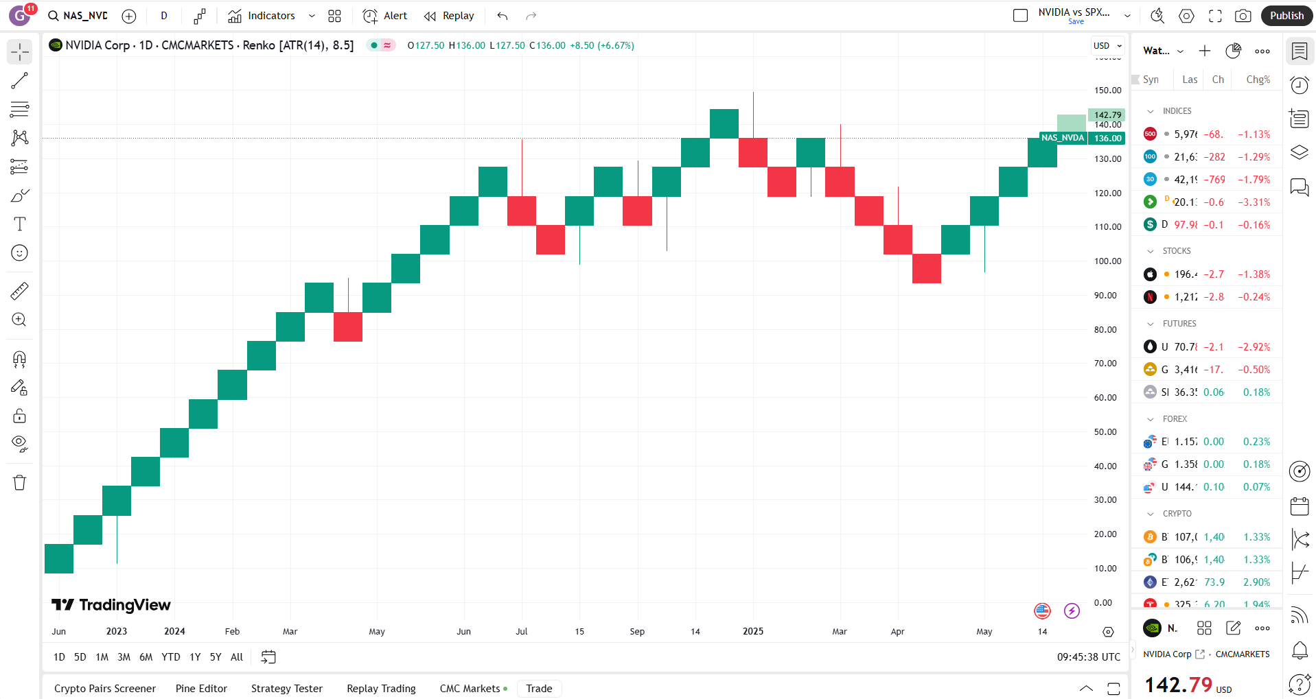
Renko charts
Renko charts focus on price changes, eschewing time-related information. Unlike standard candle charts, where each bar represents price fluctuations during a given period, Renko charts use ‘bricks’ to represent price movements. A new brick is created only when the price moves a specified amount above or below the previous brick.
Renko charts are useful for identifying potentially strong trends and filtering out small price fluctuations. However, because Renko charts remove time from the picture, they don’t show precisely when price action took place. For this reason, many traders use Renko charts alongside traditional time-based charts to gain a fuller picture.
To sum up, Renko charts can:
Potentially eliminate market noise and remove false signals.
Potentially help traders identify support and resistance levels, trends, and potential reversal points.
Miss small but potentially important price movements, while the lack of time data limits the amount of information available to traders.
Other chart types
A range of other chart types are available on TradingView, including:
Columns
Volume footprint
Time Price Opportunity
Line break
Point & figure
Range
Each chart type can be customised to suit your needs. For example, you could start with a simple candle chart. Then overlay a technical indicator by selecting the Indicators tab and choosing, say, a moving average. Once you are happy with your chart display, you can save the view for easy access.
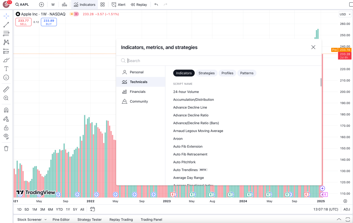
Technical indicators
In addition to the above-mentioned chart types, traders can also choose from over 100 technical indicators. From Bollinger Bands to volume-weighted moving averages, these indicators allow you to augment your charts, adding the data and insights that matter to you.
To access these technical indicators, select the Indicators tab from the top toolbar in any chart, and search for or scroll to the indicator you want to use.
Learn more about TradingView indicators to try.
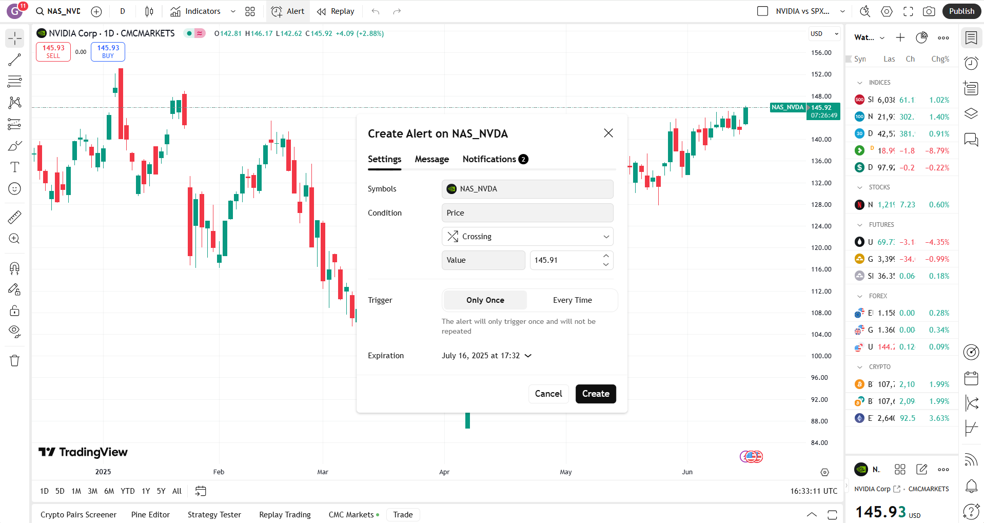
Alerts
TradingView allows you to set up personalised alerts to let you know about price movements as they happen. On a desktop computer, you can add an alert to a TradingView chart by selecting the Alert button from the top toolbar, by opening the Alert menu in the right-hand toolbar, or by right-clicking anywhere on a chart and selecting Add alert. On a mobile device, tap the three lines at the top of the chart and select Alerts.
Once you’ve set the parameters for your trading alert, you can choose how you want to receive the alert when the criteria you’ve set are triggered. Choose to receive alerts by email, as a pop-up notification in TradingView, or another option.
Disclaimer: CMC Markets is an execution-only service provider. The material (whether or not it states any opinions) is for general information purposes only, and does not take into account your personal circumstances or objectives. Nothing in this material is (or should be considered to be) financial, investment or other advice on which reliance should be placed.