Technical analysis is a form of analysis used by traders to evaluate future price action based on historical price data.
Many traders use technical indicators and charting analysis as an approach to analyse the markets and spot potential trading opportunities and suitable entry and exit points. This article looks at five advanced approaches to technical analysis to help you improve your trading strategy.
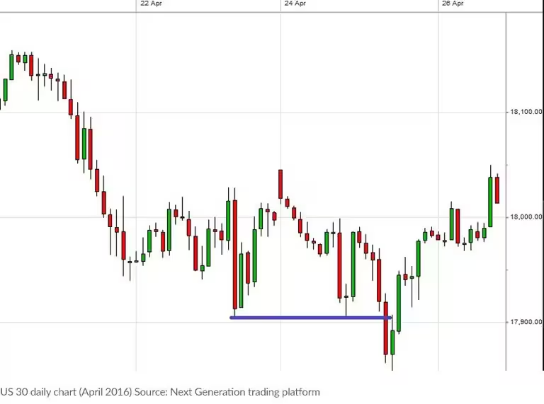
Lots of traders use candlestick charts when looking at price data and it is easy to see why. Candlesticks present the battle between buyers and sellers in a very simple-to-interpret graphical way. Candlestick charts also have their own range of patterns, with many focusing on the psychology of the market and constant battle between buyers and sellers.
What is technical analysis?
Technical analysis is the evaluation of a financial asset through the study of historical market statistics. Technical analysts don’t believe that market price movements are random. Rather, they believe that these movements create identifiable patterns and trends that repeat over time. Consequently, they use this analysis to try and forecast the future price movements of financial assets, or securities.
Typically, technical analysis is based on three theories:
The market discounts everything. In other words, everything you need to know about a security can be found in its price. For this reason analysis should focus on price charts and movements.
Price moves in trends. Market prices are more likely to continue past trends than to move erratically.
Trends repeat over time. Technical analysts believe that history tends to repeat itself. Therefore, past trends can be used to help interpret future price movements.
Understand technical analysis of the financial markets
There are numerous technical trading indicators that have been developed by analysts. They use these indicators to attempt to accurately forecast future price movements. Technical indicators are mathematical calculations which point to trade entry and exit signals. Trade signals help investors decide whether to buy, sell or hold a security or financial instrument. Technical indicators are generally used with charts. Indicators are placed over chart data to try and predict the price direction and market trend.
There are different ways that traders can use technical indicators. For example, some try to determine the strength of a trend, and how likely it is that the trend will continue. Others focus purely on identifying current market trend. Moving averages, chart patterns, stochastic oscillator, and support and resistance lines are some of the indicators used to predict price patterns in the financial markets.
Technical analysis indicators: a complete breakdown
Trading charts
Chart patterns are the most fundamental aspect of technical analysis. A technical analyst uses charts as the source of any information they are gathering. There are different types of charts used by traders, depending on their trading goals. The four primary types are line charts, bar charts, candlestick charts, and point and figure charts.
Technical analysts also use chart patterns to help them identify trading signals. They believe that certain trading patterns tend to reappear, and generally produce similar outcomes. The best place to start is by studying long-term charts, such as monthly and weekly charts spanning several years, as these give a good overview. Once a trader has gained this perspective, daily and intraday charts can be consulted. This approach helps, because a short-term view in isolation can be deceptive.
Trends
Being able to identify trends is one of the most important concepts of technical analysis. The trend indicates the general direction that a market is heading. However, identifying trends is not always straightforward because prices rarely move in straight lines. Instead, they move in a series of highs and lows and it is the overall direction of these highs and lows which establish a trend.
There are three types of trendlines: uptrends, downtrends and sideways trends. An uptrend is signalled by a series of higher highs and higher lows, while a downtrend consists of lower lows and lower highs. A sideways trend is when there is little movement up or down. Trendlines are a simple charting technique where straight lines are used to connect lower lows or higher highs. This helps to show the general direction of the trend. Plus, they can help traders to identify areas of support and resistance.
Forward PE Ratio = price/forward earnings
Price = current share price
Forward earnings = expected earnings next year; total the analyst expected earnings for the next four quarters
The forward PE ratio is based on analyst’s projections of a company’s earnings for the year ahead. For instance, if the consensus estimate among analysts was for company X to grow its earnings per share 10% this year to $2.20, its PE ratio falls to 18.18.
Support and resistance
Support and resistance levels are another important concept of technical analysis. They are areas on a chart where the market’s price struggles to break through. Support levels are formed when a falling market reaches a certain level, and then bounces. Resistance is formed when a rising market hits a high and then falls. The more times a market hits these points of support or resistance and reverses, the more reliable that projected line will be for future levels. They can be used to help make trading decisions and can indicate when a trend is about to reverse.
Correlation
Some stock movements are dependent on each other, with a clear relationship. This correlation and dependence can be of interest in technical analysis. When the prices of the two stocks move in a similar direction, they are correlated, or dependent. For example, let's say the price of oil is increasing. Gas prices have a tendency to rise as well whenever this happens. This means that they have a positive correlation. When the price of two commodities consistently move in opposite directions, they are negatively correlated. Two stocks moving independently of each other without any correlation can help with portfolio diversification. This is because when some shares in a portfolio are losing money, other non-correlated shares might still be gaining.
Moving averages
Given the volatility of price movements, chart patterns can be difficult to read. Technical analysts can use moving averages to help with this. Moving averages can remove day-to-day fluctuations, making price trends easier to spot. They are also useful for identifying support and resistance levels. Moving averages work by taking the average of past price movements. This means they are better for accurately reading past price movements but are less suitable for forecasting future movements.
The most common type of moving average is the simple moving average. Other popular types are the exponential moving average and linear weighted moving average. The most popular periods used for calculating moving averages are 50, 100 or 200 days.
How to trade using with technical analysis
Lots of traders use candlestick charts when looking at price action data and it is easy to see why. Candlesticks present the battle between buyers and sellers in a very simple-to-interpret graphical way. Candlestick charts also have their own range of patterns, with many focusing on the psychology of the market and constant battle between buyers and sellers.
Below are some of the most significant technical analysis patterns to spot when trading.
Bullish engulfing pattern
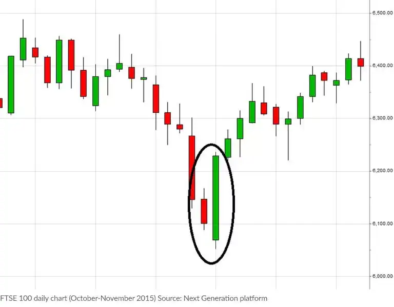
The bullish engulfing pattern occurs when a market has been in a downtrend. Bullish engulfing patterns usually consist of two complete candlesticks spanning two time periods (for instance one hour or one day). The first is a 'down' or bearish candlestick, followed by an 'up' or bullish candlestick covering the subsequent time period.
The size of the first candle can vary from chart to chart. The first candle usually signifies the end of declining prices for the markets. The second candle in the pattern should be bigger than the previous candle and should cover (or engulf) the 'body' of the previous candle. The bigger the second candle and the higher it advances, the stronger the signal.
Here is an example of the FTSE 100 index based on daily candlesticks.

